Science News
Visualizing Global Travel
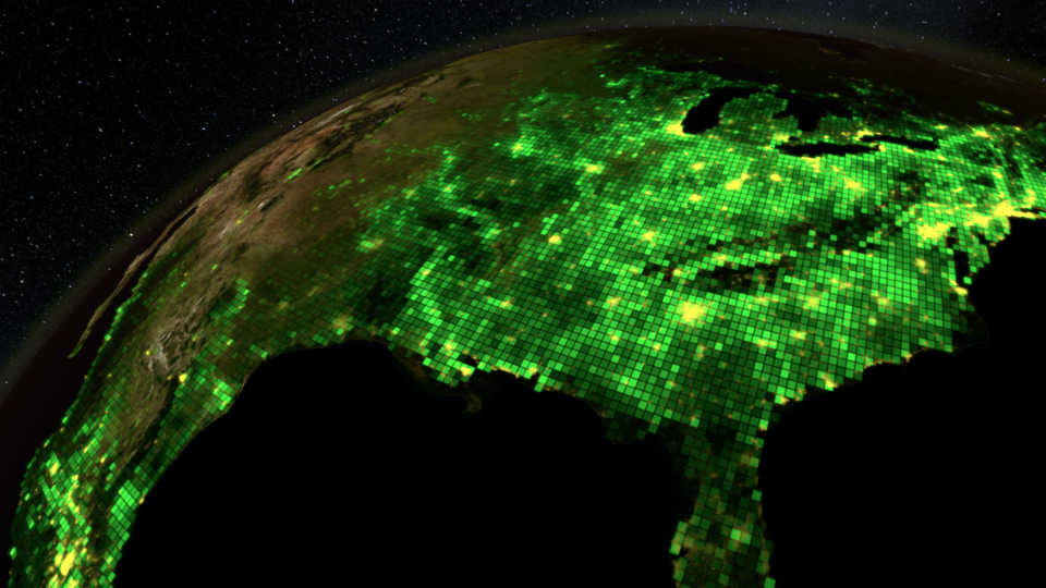
Last week, we learned about creating computer-generated kelp, but how do you use computer graphics to make data visually exciting? Ask Erik Krumrey. He spent eight months doing just that! Working on Morrison Planetarium’s new show, Habitat Earth, Krumrey took data for Earth’s carbon cycle, airplane and shipping routes, animal migrations, and agricultural development to design an engaging scene that lasts for about seven minutes in the new, 23-minute production.
And he did this with just numbers, GPS coordinates, spreadsheets, and a few still images. Data can be tricky, often including the bad with the good—errant airline flights, disappearing whales, and missing observations, to name just a few problems—so Krumrey had to sort through everything to bring the good information to life. He had to “take those tables or maps of data that you can’t see and turn [them] into something you can,” he explains.
Krumrey came from the visual effects world, creating “bomb blasts, hoards of insects, spaceships and such,” in previous work for Industrial Light & Magic (ILM) and Tippett Studios, and Habitat Life producer Tom Kennedy knew that he would be a good fit for this intense work. With Krumrey’s double masters in physics and engineering, Kennedy likely felt that he would understand “what could go wrong with the data and see what was missing,” more than other artists could.
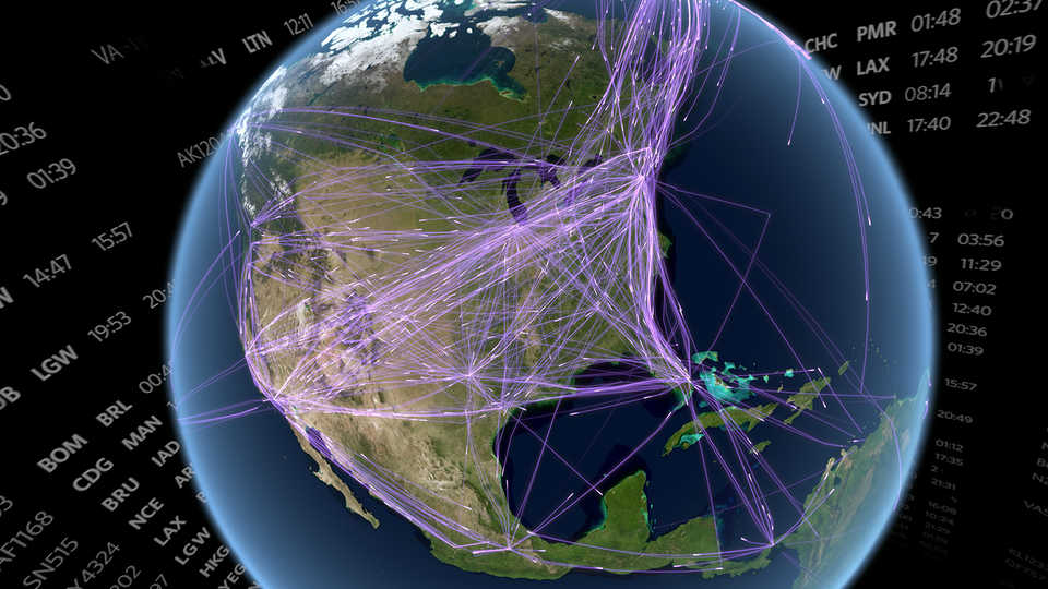
“I have the training and rigor for this type of work,” Krumrey says. He could process the data with attention to detail and look for inaccuracies along the way. “Most of the time, the data were messy,” he explains. And they were obviously not collected for visualization in a planetarium show. The airplane data were particularly challenging, he says. Originally, the dataset for the number and routes of airplanes came from recordings for atmospheric research. But Krumrey determined that these data were mostly domestic flights in the U.S., and the team wanted to fly to Europe in the show. There had to be better data, but where? Then the production team spotted maps in the New York Times reports on the flight patterns in war-torn Ukraine. A link referenced in the map gave the team much more data, this time from crowd-tracking receivers that collect the identification and position of aircraft. The results, seen in the image above, are not only visually stunning, they are completely real—nothing is made up.
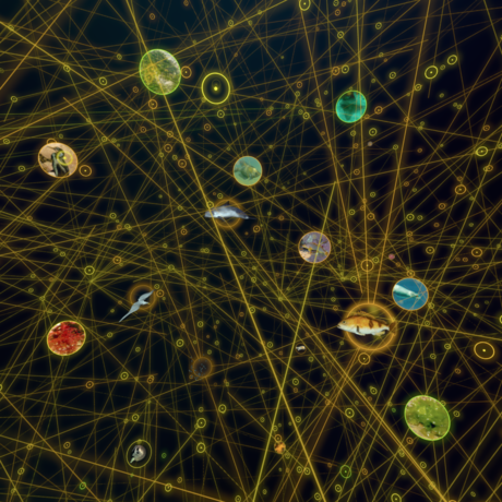
The original salmon migration data were also incomplete. “We had two sets of data,” he explains. “One was a map with a region of the northern Pacific shaded to show where salmon spawn, just big blobby shapes. The second... was a map of streams. We combined these two to only show the streams in the region where the salmon spawn.” The problem was that the stream map was derived from a shuttle radar flight and only extended to 60 degrees north, so working with data from Canadian government agencies, Krumrey fleshed out a fuller map.
Krumrey had fun with the textures and colors he used to visualize the data and learned a lot along the way. “I knew birds migrated long distances, but to see their patterns from Massachusetts to the Amazon and then back again was amazing. And I understood it in a whole new way.” He hopes his visualizations help others grasp these patterns and movements, too. He’s currently working on highlights of the data visualizations for students and educators.
Beyond displaying accurate data, Krumrey also had to ensure that the show’s message is woven throughout each visualization he created. “Living day-to-day, we’re only really aware of our local surroundings, maybe out to a distance of 10 or 20 miles, imagining that the rest of the world is far away and disconnected from us. But Habitat Earth shows us how we’re part of a connected world—whether it’s birds, ships, or something else making those connections. What happens on other continents is directly connected to us, and what we do here affects those other continents.”
